ShopDreamUp AI ArtDreamUp
Deviation Actions


Suggested Deviants


Suggested Collections


You Might Like…


Featured in Groups


Description
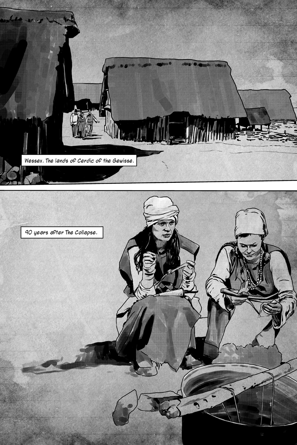
IRON
Page 4 of IRON.
In case anyone's interested, IRON is set sometime around 500AD in the fledgeling kingdom of Wessex. The time period is a fascinating one, with the Romans having left around a century or so previously, leaving the people to try to survive surrounded by the crumbling ruins of technologically advanced cities they can no longer support, and with roving gangs of brigands, pirates and invaders from across the sea causing havoc. We have been through a post-apocalyptic event, and this is when it was.
My goals are to get it out looking OK, and also to try out different things. The flow of the layout. The way the style works with both action and domestic scenes and its handling of longshots and close ups.


MangaStudio / Illustrator / Photoshop
IRON is ©2013 Jonathan Wyke
Page 4 of IRON.
In case anyone's interested, IRON is set sometime around 500AD in the fledgeling kingdom of Wessex. The time period is a fascinating one, with the Romans having left around a century or so previously, leaving the people to try to survive surrounded by the crumbling ruins of technologically advanced cities they can no longer support, and with roving gangs of brigands, pirates and invaders from across the sea causing havoc. We have been through a post-apocalyptic event, and this is when it was.
My goals are to get it out looking OK, and also to try out different things. The flow of the layout. The way the style works with both action and domestic scenes and its handling of longshots and close ups.
MangaStudio / Illustrator / Photoshop
IRON is ©2013 Jonathan Wyke
Image size
1000x1497px 981.22 KB
Comments3
Join the community to add your comment. Already a deviant? Log In
The story is very good so far.
(My first impression in the starting pages was that it was an oriental story, because of the thin swords and the ponytail in one of the warriors... my bad, i totally forgot to read your text. The outfit of the warriors is ok, very plausible, with pieces of roman lamellar armor attached.)
In this page the village is spot-on and the two ladies have an excellent pose and position in the scene. The background textures gives the full page an homogeneous look and also that little touch of dirt according to the story time frame. Maybe the ground should be darker.
About the drawing style... perfect. The seemingly abstract shade works like a charm with the perfect lineart, balancing each other, so the artist dont have to overdraw the page. "Less is more".
Cheers and good luck.